Gallatin, Tennessee
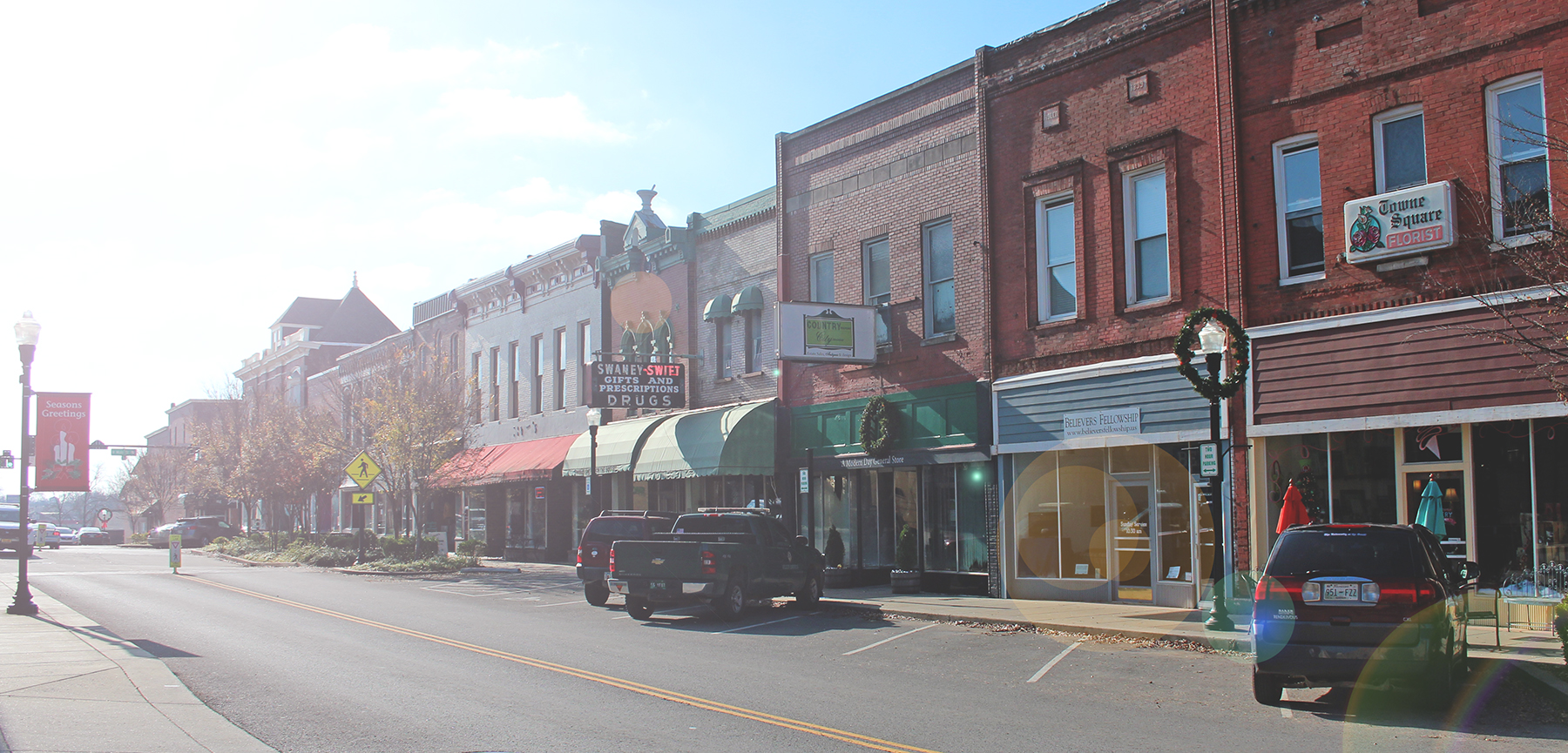
For those who want a place that is comfortable in its own skin, Gallatin, close to Nashville and the county seat of Sumner County, is a mix of influences old and new, protecting its original grit and grace even as it welcomes progressive growth.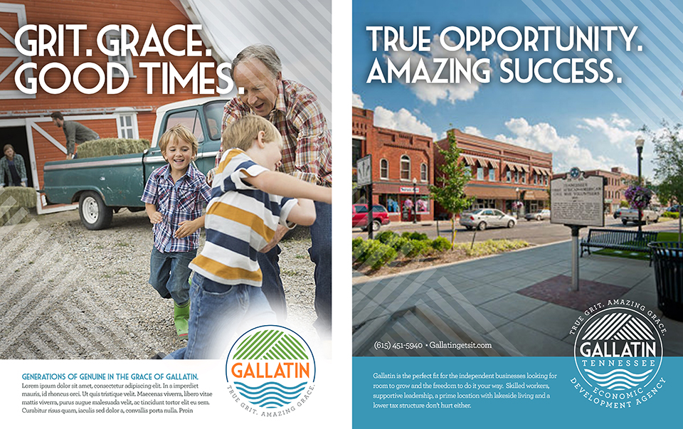


Category
Community Wide, Economic DevelopmentAbout This Project
Over the past decade, Nashville has taken center stage on the national radar. Many of the smaller surrounding communities have been absorbed by Nashville’s famous brand becoming known as suburbs or bedroom communities. But nearby historic Gallatin has too much attitude and sense of self to be known as anyone’s suburb. Community leaders wanted a brand that clearly defines what makes Gallatin such a special place while still leveraging its prime location near Nashville.
Gallatin is that rare town that’s perfectly comfortable with its own place in the world. While the town has lots going for it (history, location, nature, opportunity), most of its attitude comes from the people who choose to live there. Folks from Gallatin would rather focus on enjoying their own lives than worry about keeping up with the Joneses, with Nashville or anyone else. Strong character and strong opinions mean they do things their own way, with an eye toward what works not what’s trending. And they’re refreshingly unconcerned about trying to impress people – which is what impresses so many people who go there.
Brand Identity
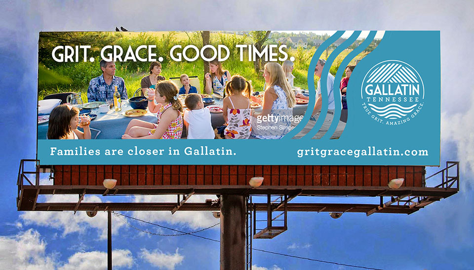
Strapline – The line True Grit. Amazing Grace immediately gets to what is distinctive about Gallatin: A city where grace and beauty coexist alongside a proudly preserved, this-is-who-we-are grittiness that has not been scrubbed away in the name of progress and gentrification. The two phrases are well-known in their own right, which makes the line more memorable.
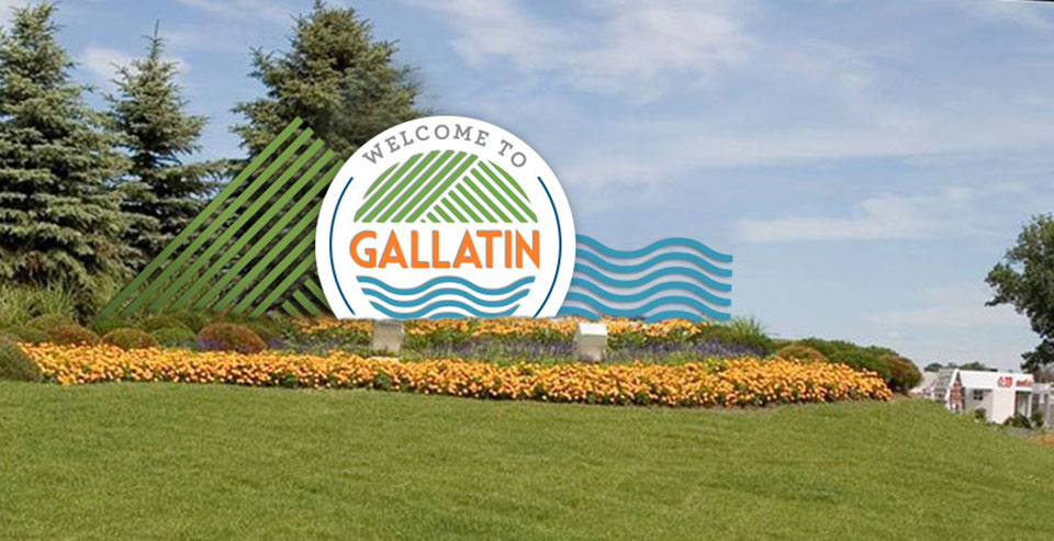
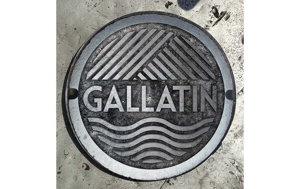
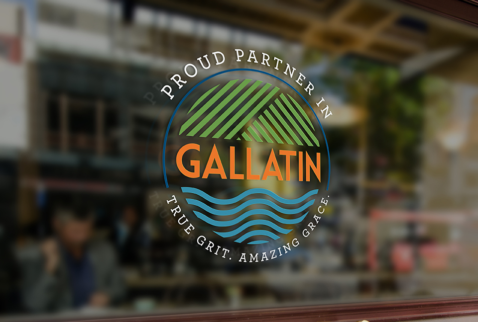
Logo – So much of Gallatin’s True Grit and Amazing Grace is wrapped up in the natural beauty of the place. In the logo, the natural beauty of Gallatin takes center stage as a symbol for all the grit and grace in the community. The land is represented by the graphic lines at the top of the circle. The water is represented by the waves below. The people of the community and their close connection to each other and the land is embodied by the circle that encloses and protects it all.
Color Palette – The color palette contains a green and blue to further tell the story of Gallatin’s land and water. While the blue and green are slightly muted like faded jeans, they are still rich and saturated. A pop of orange for the city name represents energy, optimism and perseverance. In a competitive landscape where the majority of logos feature muted, distressed or historic colors, the goal of the Gallatin logo is to bring to life the vivid hues of the natural landscape and the character of the people.